Advice for New Bloggers: 5 DIY Tricks to Optimize the look of your Blog
Ever since my friend Beth asked me to take part of the Let's Get Acquainted New Blogger Hop advice series I have been thinking about the advice I wanted to share with you. I started this blog at the end of 2011, but I didn't really started blogging until early last year. To be honest, I did not know what I was doing. Thankfully, I met Beth and joined the Blog Hop. It was one of the best experiences. I met wonderful bloggers from whom I've learned so much and continue to inspire me.
Over the past year and a half I have learned that the design of your blog plays a key role and one should spend some time making things look nice and tidy. For me, the design of my blog is a work in progress and continues to evolve with me as I learn more about blog design and the interesting and very intimidating subject that is HTML coding. The design of your blog is something very personal and it is what makes every blog unique, but here are some simple tips to help you optimize the look of your blog and make it more reader friendly.
Your blog header is like the front door to your house. It is the first thing visitors see when they stop by. Your blog header should make a statement , but it should not be so big that it takes up half of the page and readers have to scroll down to be able to read your latest post. Blog headers are topically 200-300 pixels in height. This allows the reader to view your blog header and part of the first post in most computer monitors.
When it comes to designing your blog header the possibilities are endless (i.e. just the name of your blog, some cute graphics, a photograph or a collage of photos). It might take some time for you to find what exactly suits your taste. But that doesn't mean you can't have fun. Try out different designs until you find something that you absolutely love and you feel reflects the essence of your blog.
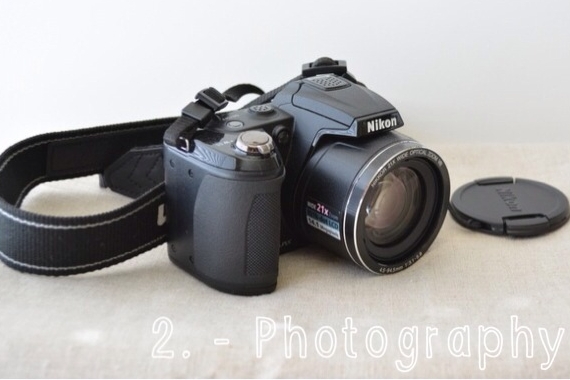
"A picture is worth thousand words" it might sound like a cliche, but it is absolutely true. Photos are an essential part of of blogs. And some readers might be discouraged from coming back to your blog if the photos are poor. So take time to get know your camera and its settings. When taking photos for your blog take lots of pictures (and I mean a lot) in every possible angle you can imagine, play around with the settings of your camera so you can experiment and find out what works for you. Take advantage of free photo editing software products available such as Picasa, PicMonkey and Aviary (integrated on your Flickr account). Here you can read a post I wrote a while back about improving your photography on a budget.
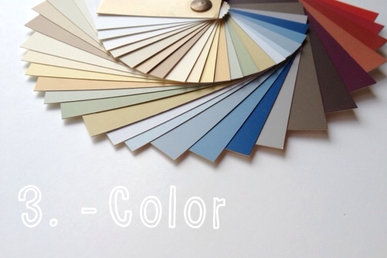
Avoid bright colors and busy backgrounds for your blog. They are distracting and keep your readers from focusing on the content. Instead use a neutral or white background and allow your photos to shine.
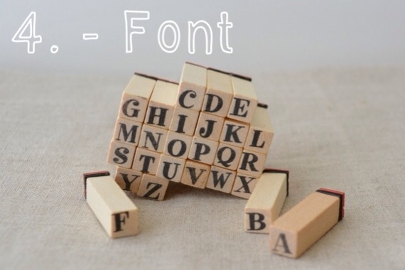
There are some cool fonts out there and it may be tempting to use them in your blog (I've done it). However, some of those fonts are difficult to read and not very easy on your reader's eyes. Keep the font of the body of your post plain and simple. And reserve those special fonts for accents such a post title or tabs. Additionally, choose a black or gray color for the text of your blog post, bright colored fonts are not easy to read either.
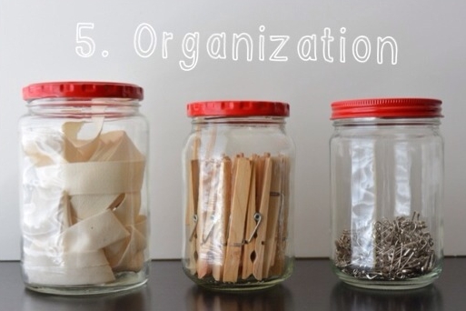
Make it easier for you readers to find content in your blog. The pages feature offered by Blogger and Wordpress are an excellent feature for organizing your blog and directing your readers to specific content such a a list of the tutorials you have written, the projects you have completed, etc. Blogger allows you to add the pages to the top of your blog (right underneath your blog header), on the side bar or manually link to each page individually.
If you missed the Advice to New Bloggers from the previous weeks, please be sure to check it out!
Thank you for Stopping by!
Martha.

